Landing Page That Converts: 11 Things to Get Right
 MD Rakibul Islam RakibFull-stack developer, DevOps & Linux engineer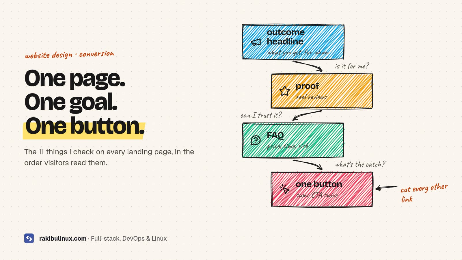
A landing page converts when it has one goal, a headline that names the outcome, proof near the button, answers to objections, and loads in under 2.5 seconds.
Most landing pages I'm asked to fix don't have a design problem. They have a clarity problem: three different buttons, a headline about the company instead of the customer, testimonials hidden at the bottom, and a hero image so heavy the page takes five seconds to show anything on a phone. Visitors decide fast whether a page is for them. This checklist covers the 11 things I check on every landing page I build or review, in the order a visitor experiences them.
Key takeaways
- One page, one goal, one main button. Every extra choice lowers the chance of the one you want.
- The headline says what the visitor gets, for whom, in plain words. Your company name can wait.
- Put proof next to the ask: real reviews, client names, numbers you can back up.
- Answer objections on the page with a short FAQ: price, time, risk, what happens next.
- Speed is part of conversion. Aim for a Largest Contentful Paint under 2.5 seconds on mobile, and measure conversions so you know what works.
Above the fold: the first five seconds
1. Pick one goal
Decide the single action the page exists for: book a call, request a quote, start a trial, buy. Remove the main menu if you can, or at least keep it minimal, and make every button on the page do that one thing. A landing page from an ad with links to your blog, careers page and social profiles is leaking visitors.
2. Write a headline about the outcome
Compare "Innovative Cloud Solutions" with "Your website back online in hours, not days." The second tells the visitor what they get. A good formula is outcome + for whom + without the pain: "Bookkeeping for small cafés, done in a day a month." Under it, one sentence explains how.
3. Make the button say what happens
"Submit" and "Learn more" are weak. "Get my free quote", "Book a 15-minute call" or "Start fixing my site" set expectations. Show the main button above the fold on mobile, give it the strongest colour on the page, and repeat it after each major section.
4. Show the product or the result
A real screenshot, a short demo, a before-and-after or a photo of your actual work beats an abstract illustration. Visitors want to see what they're buying. Size it properly: this image is often the page's Largest Contentful Paint, so it must be compressed and loaded first.
Below the fold: earning the click
5. Proof, right where the decision happens
Put your strongest proof immediately under the hero and again near the final button: short reviews with real names, client logos (with permission), a project count or rating you can back up, and case results. Specific beats glowing: "Fixed our checkout in a day, sales came back the same evening" persuades more than "Amazing service!". Never invent testimonials or numbers. Besides being dishonest, fake reviews break consumer protection rules in many countries, and visitors can usually tell.
6. Benefits first, features second
Three short blocks, each a benefit in the customer's words with the feature that makes it true underneath. "Never lose a booking" (benefit) → "automatic SMS reminders 24 hours before" (feature).
7. Show how it works in three steps
People hesitate when the next step is unclear. "1. Tell us about your project. 2. Get a fixed quote within a day. 3. We build it, you approve each milestone." Three steps make the decision feel small.
8. Answer objections with a short FAQ
List the questions you hear on sales calls: How much does it cost? How long does it take? What if I'm not happy? Do I need to prepare anything? Answer each in two or three sentences. A FAQ also gives Google and AI answer engines clear question-and-answer text to show, which brings more qualified visitors.
9. Keep the form short
Every field you add is a reason to leave. For a first contact, name, email and one open question ("What do you need help with?") is usually enough. Ask for budget, phone and company size later, or make them optional. Show what happens after submitting: "I reply within one working day."
Under the hood: speed, mobile and measurement
10. Make it fast on a phone
Google treats a Largest Contentful Paint under 2.5 seconds as good, and slow pages lose visitors before they've read the headline. Compress the hero image and load it with high priority, use at most two font families, and drop heavy sliders, chat widgets and tracking scripts you don't use. My guide to fixing a slow LCP walks through each step. Then test on a real phone: tap targets big enough, no text too small, no sideways scrolling, the form easy to fill with a thumb.
11. Measure conversions, then change one thing at a time
Track the button clicks and form submissions as conversions (key events in Google Analytics 4, or your ad platform's conversion tracking). Without that, you're redesigning on opinions. Once you have a baseline, test one change at a time, headline first, because it has the biggest effect. Small sites rarely have the traffic for formal A/B tests; changing the headline for two weeks and comparing the conversion rate is still far better than guessing.
Website builders or a custom page?
Builders like Webflow, Framer and Wix can produce a good landing page if you follow the checklist above, and they're quick to edit. A custom page built in Next.js gives you full control over speed, tracking and integration with your app or CRM. I compared both in AI website builders vs a custom website. If you're replacing an existing site, read how to redesign without losing SEO first.
Frequently asked questions
What makes a landing page convert?
A clear single goal, a headline that states the outcome for a specific visitor, one obvious button, proof near that button, answers to common objections, a short form, and a page that loads quickly on mobile.
How long should a landing page be?
As long as it takes to answer the visitor's questions. A free download can be short. An expensive service needs more proof and more answers. Keep the main button visible at the top and repeat it after each major section so long pages don't hide it.
Should a landing page have a navigation menu?
For ad and campaign pages, usually not, or only a minimal one, because every link away from the page is a lost conversion. A service page on your main website can keep the normal menu.
How many form fields should a landing page form have?
As few as you need to start the conversation, often three: name, email and a short message. Extra qualifying questions can be optional or asked in the follow-up.
How do I know if my landing page is working?
Track conversions as events in your analytics and divide them by the number of visitors to get a conversion rate. Compare it over time and after each change, rather than judging by how the page looks.
Want a landing page built to convert?
I design and build fast landing pages with clear copy structure, real proof, conversion tracking and a sub-2.5-second load on mobile. See my landing page design and build service, all website design services, or contact me with your current page and the one action you want visitors to take.

Written by
MD Rakibul Islam Rakib
Full-stack developer, DevOps engineer and Linux system administrator with 5+ years of production experience. I deploy, harden and fix servers and web apps for clients worldwide, and everything in this article runs on real servers I manage, including this site.
- landing page that converts
- landing page checklist
- conversion rate optimization
- landing page design
- call to action
- landing page speed